Color is the first thing a guest registers when your invitation opens in WhatsApp, before a single word is read. The right palette signals in a second whether the wedding is intimate or grand, classic or bohemian, a morning on the lawn or a glamorous evening in a hall. It also keeps the names, the date, and the RSVP button effortless to read on any screen. Here are seven combinations that work, with the mood each carries and the season it suits.
How a palette is built
Before choosing shades, understand the structure. A palette that works almost always has only three roles:
- Primary color — owns the background or frame and sets the overall tone.
- Secondary color — for headings, names, and dividing lines.
- Accent color — one standout shade for the RSVP button, the Waze navigation link, and the add-to-calendar button.
The rule is to stop at three. The moment you add a fourth and fifth color, the invitation starts to look crowded and loses legibility on a small phone screen. If you are not sure where to begin, it helps to read the complete guide to digital wedding invitations first, which walks through every step from scratch.
Seven winning palettes and the mood of each
- Coral and cream — warm, romantic, and current. Our favorite in the studio. Suits an afternoon wedding, a green garden venue, and anyone who wants warmth without a sugary pink.
- Sage and gold — natural and polished at once. Calm sage green with refined gold touches. Perfect for a nature wedding, a vineyard, or a rustic courtyard.
- Dusty blue — serene, clean, and a little nostalgic. A soft blue that never reads cold. Lovely for a morning wedding, a seaside event, or a couple who loves an airy look.
- Burgundy and blush — rich, dramatic, and flattering. Deep burgundy softened by a powdery blush. A strong choice for a winter wedding and a glamorous evening in an enclosed hall.
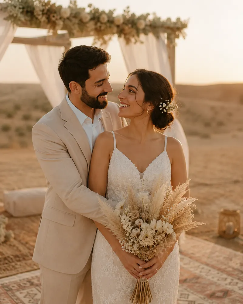
- Terracotta and sand — warm and earthy, desert-inspired. Clay and sand tones. Ideal for a bohemian wedding, the south of the country, and cream-toned dresses.
- Black and cream — minimalist and luxurious. A clean contrast with no extra color. Perfect for an urban wedding, a designed hall, or a couple who loves a restrained, fashion-forward line.
- Lavender and silver — delicate, feminine, and light. Soft purple with flashes of silver. Wonderful for a spring wedding, a daytime event, or a dreamy aesthetic.
Matching color to season and venue
A color looks different in the morning on a sunlit lawn and at night in a hall with warm lighting. A few rules of thumb:
- Summer and morning — light, fresh tones: dusty blue, sage, lavender. They breathe with the daylight and never feel heavy.
- Winter and evening — deep, warm tones: burgundy, terracotta, coral. They look rich under artificial lighting.
- Green garden venue — coral and cream or sage and gold sit beautifully against foliage.
- Enclosed designed hall — black and cream or burgundy and blush convey the luxury of the space.
If you want to see how each palette connects to a full design style, we have gathered invitation design ideas by style with real examples.
Readability on the phone: the rule you cannot break
A digital invitation almost always opens on a phone, sometimes in bright sun on the way to work. If the contrast between text and background is weak, the names and the date simply disappear. A few rules that keep everything legible:
- Keep contrast high between text color and background. Dark text on a light background is always safer than the reverse.
- Do not set gold on cream or silver on white — the tones merge and vanish. Save metallics for decoration, not for the text itself.
- The accent button must stand out — if the RSVP button is close in color to the background, guests simply will not tap it.
- Test on a real screen, not only the computer — send it to yourself on WhatsApp and open it outdoors in daylight.
A quick test: send the invitation to your mother and one friend and ask, ‘Open this outside and tell me if you can see the date and the RSVP button without straining.’ If both read everything within two seconds, your contrast is fine.
Budget and time: how much it matters
Color does not affect the price. Digital invitation packages in Israel run roughly between 250 and 600 NIS, regardless of the palette you choose. Payment is easy to settle through Bit or PayBox, and the invitation itself includes RSVP, navigation via Waze or Google Maps, and add-to-calendar. The real value is that you pick one shade and get a single visual language for the whole wedding, from the invitation to the directional signs at the hall.
Ready to choose? Pick the package that fits you, tell us which palette spoke to you, and we will continue together on WhatsApp until your invitation is exactly right.