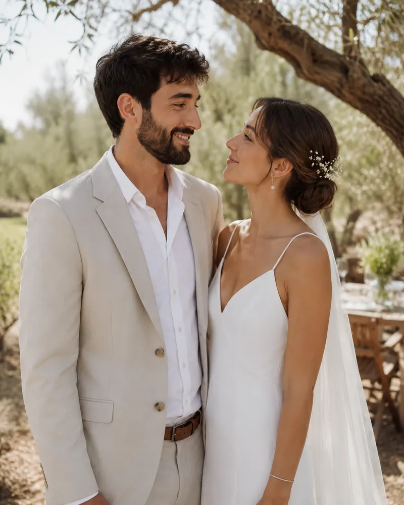
The first moment a guest steps into your wedding starts long before the first course. It starts with the sign that greets them at the entrance, the second they step out of the car and look for where to go. A good welcome sign does more than point people in the right direction; it tells the story of the evening before it has even begun. This guide walks through wording, sizes, matching your invitation, and the digital options that make your entrance unforgettable.
Why the welcome sign matters more than you think
Guests arrive after a full workday, some stressed about parking and touched-up makeup. The sign at the entrance is the first thing that calms them and confirms they are in the right place. It is also the first photo spot of the evening, so it has to look excellent both to the eye and through a smartphone lens.
- It confirms the guest is at the right place on the right date.
- It sets the tone of the evening: romantic, bohemian, classic or modern.
- It becomes the backdrop for photos that get posted to stories that same night.
Wording that works: what to put on the sign
The temptation is to cram in too much text. A guest passing by reads a sign in two seconds, so every extra word is noise. Keep to three elements: the couple’s names, a short welcome line, and the date. If there is a seating chart, point to it in a single sentence.
Welcome to the wedding of Daniel and Shir. We are so happy you came to celebrate with us. Wednesday, 18 February 2026.
For directional and bar signs the wording is even shorter. A parking sign needs just an arrow and one word. At the bar you can play with local humor, like cocktails named after the couple, but always keep it readable.
Sizes, materials and placement
Size depends on the distance from which the sign is read. At the wide entrance of a hall or event garden, a 70x100 cm sign on a stand looks dignified and reads clearly. In more intimate corners, like a bar or gift table, A3 or A4 on a tabletop stand is enough.
- Main welcome sign: 50x70 or 70x100 cm on a wooden or metal easel.
- Directional signs: A3 on a stand, or mounted on the entrance wall.
- Bar sign and seating chart: A3 up to 50x70, depending on the number of names.
Materials range from foam board (white and light) to glass, clear acrylic or a mirror with lettering. In Israel a single printed sign starts around 150 to 300 NIS, and a full set of signage in premium materials can reach 1,500 NIS and up.
A perfect match between invitation and signage
This is the secret behind an event that looks curated and intentional. When a guest received a digital invitation on WhatsApp with a certain font, color and illustration, and then sees that exact language on the entrance sign, a complete brand feel takes hold. That is precisely the principle we follow when we design one event suite.
If you have not yet settled on a design direction, it is worth browsing invitation design ideas by style and picking one language to carry both the invitation and all the signage on the night. That way the floral color on the invitation echoes on the sign, on the dessert napkins, and every detail speaks the same language.
Digital signage: when a screen replaces cardboard
A digital display at the entrance is the growing trend, and for good reason. Instead of a single printed sign, one screen can run a sequence of messages: a welcome line, a seating map, photos of the couple, and even a QR code that leads to RSVP or the Waze for the next venue of the evening.
- Flexibility: you can update text at the last minute, with no reprinting.
- Experience: a sequence of photos and a short clip creates atmosphere right at the entrance.
- Digital connection: a QR code on the screen links straight to RSVP, navigation, and a gift corner via Bit or PayBox.
This idea fits perfectly with the digital invitation you already sent. If you want to understand how it all connects, from the invitation to the entrance of the hall, the complete guide to digital wedding invitations explains the entire digital experience chain of the evening.
Final tips for clean design
- Keep high contrast between text and background, so it reads even in the low light of evening.
- Do not use more than two fonts on a single sign.
- Check the spelling of names and the date twice; a mistake on a large sign stands out badly.
- Make sure the stand is stable, especially in an open event garden where there is wind.
The right signage is the small detail that turns an ordinary entrance into an experience. If you want your invitation and signage to speak the same language, pick the package that suits you and we will continue together on WhatsApp to design an evening that looks perfect from the entrance to the last dance.