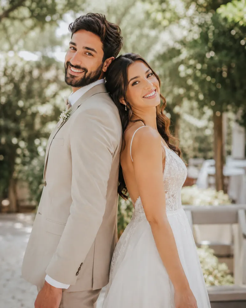
There is a single moment when a guest opens your message on WhatsApp, and the invitation has to say everything before a single word is read: this is a high-end wedding. The elegant look is not born from lots of ornament but from restraint, generous white space and precise design choices. In this guide we unpack what makes a digital invitation feel like a heavy cotton-paper envelope, only on a screen.
Serif Typography: The Visual Language of Luxury
The font is the first thing the eye registers, and it sets the tone. A classic serif, with a gentle contrast between thick and thin strokes, signals tradition and quality. Choose a face that has presence yet stays fully legible at small sizes on a phone.
- The couple’s names centred, large, in the primary serif
- Subheadings in a thinner, quieter cut of the same family
- No more than two font families in total
- Slightly open letter-spacing in headings for a calm feel
For a deeper look at matching a style to the couple, browse our wedding invitation design ideas by style and find the line that speaks to you.
Generous Spacing: What You Don’t See Makes the Difference
The best-kept secret of luxury design is empty space. When the text breathes, the eye rests, and the feeling shifts from busy to exclusive. Instead of filling every corner with decoration, let the names and the date stand alone with plenty of air around them.
- Wide margins around every block of text
- A clear separation between names, date, venue and RSVP
- A thin dividing line instead of a heavy border
- No flooding the screen with illustrations, however pretty
Sophisticated Monochrome: When Less Colour Is More
A monochrome palette, or close to it, is a fast shortcut to luxury. Cream, sand, charcoal and a muted gold create a polished image that does not date. You can add a single accent tone, such as deep olive or burgundy, but the base stays calm.
Save the date Maya and Daniel are getting married Saturday, 12 September 2026 Ha-Sharon Garden Venue, Ra’anana Full details and RSVP to follow
On-Screen Gold-Foil Effect: Accent, Not Background
Gold is the instant shorthand for an expensive event, but on screen it is tricky. A warm gold gradient, shifting slightly between light and dark, creates the illusion of real foil. The key is to use it at a single focal point only.
- Gold on the names or on a large opening letter
- A thin gold rule separating sections of the invitation
- Avoiding gold text on a light background, which hurts legibility
- Always testing on a real phone screen, not just a desktop
Subtle Motion: Luxury That Comes to Life
A genuine advantage of the digital invitation is motion, and here you need an especially light hand. A soft fade-in of the text as the guest scrolls, or a gentle shimmer that passes once across the gold, signals investment and quality. Aggressive or flashing motion achieves exactly the opposite.
- A slow entrance animation for the names when the invitation opens
- A smooth transition between sections on scroll
- A one-time, non-repeating shimmer on the gold
- Keeping load times fast so everything feels seamless
For the full picture of the digital invitation process, from choosing a design to sending it to guests, read our complete guide to digital wedding invitations.
What It Costs and Whether It’s Worth It
A luxury digital invitation with a custom design usually costs between 250 and 600 shekels, depending on complexity and whether elements like animation and a guest map are included. Against printing and mailing hundreds of physical invitations, the saving is significant, and the value adds up: automatic RSVP, direct navigation in Waze or Google Maps, and an add-to-calendar link. Payment is easy via Bit or PayBox, and the invitation reaches each guest directly on WhatsApp.
If this elegant look speaks to you, we would love to go through the packages together and find the one that fits your style and budget. Send us a message on WhatsApp and we will start designing the invitation that conveys exactly the event you dreamed of.