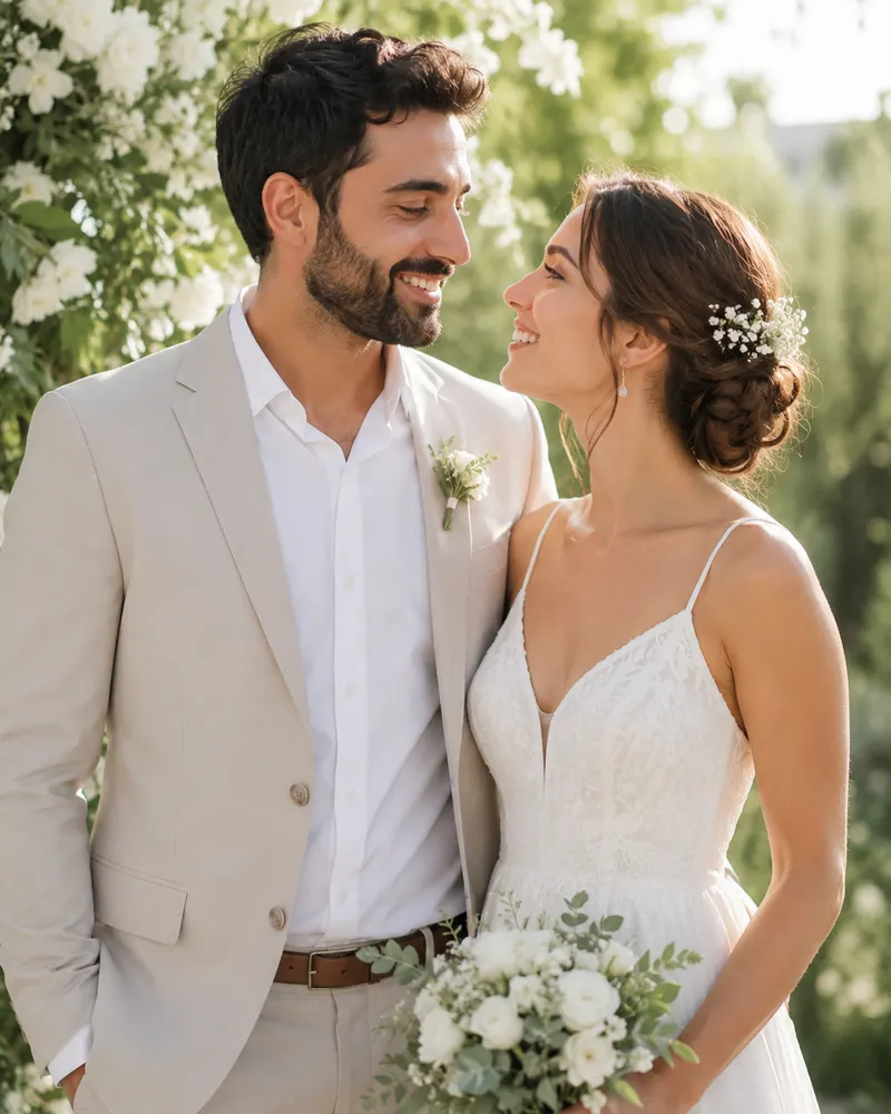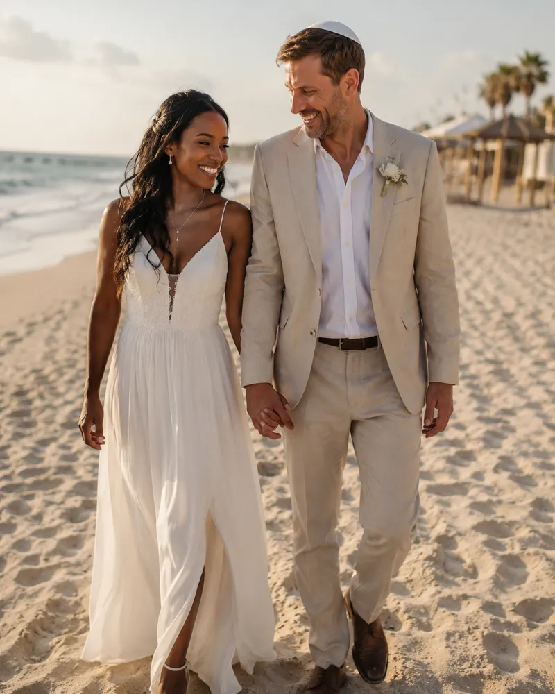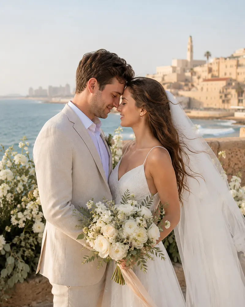
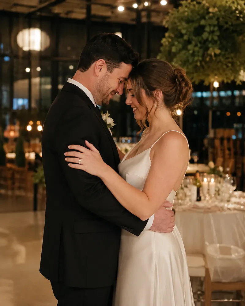
There is something about watercolor that softens the heart before you have read a single word. The gentle washes, the colors that bleed into one another, a flower that opens at the edge of the page with no hard outline, all of it tells a story of love that is tender rather than loud. In the world of digital wedding invitations this style has become one of the most loved, and it is easy to see why. It is warm, personal and dreamy, and it sits beautifully on a phone screen. In this guide we will look at what makes a watercolor wedding invitation genuinely beautiful, and how to keep it both readable and romantic.
What makes watercolor feel romantic
The magic of watercolor comes from its imperfection. Unlike a flat, even fill, a wash leaves slightly transparent edges, lighter and darker pools, and a sense of movement. The eye reads this as something human and hand-painted rather than machine-made.
- Soft color transitions that blend into one another with no hard dividing line
- Transparent layers that let light and paper peek through the color
- Flowers, branches and petals painted in free strokes rather than precise lines
- Random pigment blooms at the edges that add depth and a dreamy atmosphere
If you are still mapping out your design direction, it is worth browsing our invitation design ideas by style to see how watercolor sits alongside minimalist, boho and classic looks.
The secret to text that stays legible
This is where many beautiful invitations fall down. The color is stunning, but the couple’s names disappear into it and the ceremony time is impossible to read. It is the first thing we check, because an invitation no one can read is not doing its job.
- The important text sits on a light area of the wash, or on a gentle white layer laid above the color
- Choose a clear typeface with enough weight, not a thin hairline that vanishes over color
- Keep real contrast between the color and the text, even when you check the invitation in sunlight
- Give every line room to breathe instead of crowding it over a busy floral patch
Maya and Daniel would love to celebrate with you On Thursday, the 12th of June 2026 At the Vineyard Garden venue, just outside Pardes Hanna Reception 7:00 PM, ceremony 8:00 PM Confirm your seat at the link, navigate with Waze and save the date to your calendar
Palettes that flatter watercolor
Not every color behaves well in this look. The tones that work best are soft and slightly muted, because they leave the washes room to breathe without turning muddy.
- Peach and soft coral, a warm sunny palette that is perfect for summer in nature
- Dusty rose and a pink blush, romantic and classic without being saccharine
- Sage and soft green, calm and natural for garden weddings
- Dusty blue and lavender, cool and gentle for a more dreamlike mood
- Sand, cream and muted gold as an accent, for an elegant finish
A small tip: stick to a palette of two to three tones from the same family. Too many clashing colors make the washes feel busy and lose the softness.
When this style truly fits
Watercolor is not right for every wedding, and that is perfectly fine. It shines when the mood is soft, natural and romantic, and it suits a very formal or sharply urban event far less.
- Spring and summer weddings in nature, in a field or a vineyard
- Garden venues with plenty of greenery, natural light and foliage
- Morning or sunset ceremonies with a dreamy atmosphere
- Couples who love a hand-painted look that feels warm rather than digital
If you are weighing up a few directions, our complete guide to digital wedding invitations helps you order every decision, from style through to RSVPs and budget.
How it works with us
Your invitation is a single link you send on WhatsApp, and inside it everything is arranged: the watercolor design, an RSVP that updates for you in real time, a navigation button that opens straight into Waze or Google Maps, and a reminder that saves to the guest’s calendar with one tap. We match the washes and the palette to your own wedding colors, so everything speaks one language from the very first moment. Payment is easy to settle, including Bit or PayBox, and prices generally range from a few hundred shekels for the basic package up to fuller packages with complete guest management.
The soft look reads beautifully even on a small screen, and that is exactly why we check every invitation on a phone before it goes out to you.
Choose the package that suits you and continue with us on WhatsApp, and we would love to design you a soft, dreamy invitation that tells your story before your guests even arrive.